Piped Pencil Skirt

This is another project from one of my classes, this time from my Advanced Sewing class.

I love pinstripes!

The requirements for this assignment were a lined skirt with a back vent. I went a little beyond that and did one with a yoke, in a pinstriped fabric (that I ended up not matching as well as I would have liked), with piping on the princess seams. I did well on this project, but that does not mean it is perfect.

The pinstripes are not as obvious in person as they are in the picture, so the mismatch from the yoke to the main body of the skirt is not as obvious. The downside is that the color difference in the pinstripes isn’t all that noticeable. Even here it’s hard to see that half of the stripes are brown and the other half are lavender.

The piping is actually a trick that was suggested to me. Because of the curved princess seams, it was going to be nearly impossible to get the pinstripes to line up across those seams. I needed to break up the lines. So, I added piping. Now you can’t tell if those lines are matched up or not. I love little tricks like that!

Knit Dress

Today we’re going to take a look back at one of my projects from my Intermediate Sewing class over a year ago.

This was my first time working with a knit, and after this, I can honestly say I don’t really like working with them. They snag and pull and getting them to lay flat is a pain in the butt. I love this style though, so I guess I can tolerate working on knits every once in a while. I do know that they’re way easier on a serger, and now that I have my own, I might actually consider working with knits more often.

I love this style, but I don’t think I like the fabric now. The color is alright, but the scale of the print is all wrong for me. That’s probably why I don’t wear it. I do love the skirt part though. It has great drape to it, and it’s the perfect length (right around the knees). The binding gave me fits too, but that’s because it was a knit as well. In hindsight, I probably could have picked a better fabric, but I was going for the right color at the time. I think I’m going to go back and remake this sometime soon-ish when I get a spare minute.

The Gold Coat

I’m back! I know, I took a (very long and unintended) break, and those of you that know me know I’ve been insanely busy, but the important part is I’m back now. In honor of my return, I’m going to take us back in time to a project I lovingly call my coat

Steampunk Coat

This thing is amazing! I originally made this to be part of a steampunk costume, but I loved it so much it is now my every-day coat. The gold and black fabric is actually an upholstery fabric I found buried in the back room of my favorite fabric warehouse. I’m pretty sure I bought all of it just because I loved it so much. I used most of it on this coat, but I have a little bit left that I’m saving for a corset or a vest or something. I just love the shine of the gold so much that I can’t decide what to do with the little I have left. It’s lined in plain black satin.

The buttons were a surprise find at Joann’s. Normally I don’t really like the stuff they have, but I stumbled on these and I knew they were perfect for this fabric. Most people think that they’re covered buttons at first glance. I actually wanted to do covered buttons, but this fabric is way too thick for that.

Looking at it now, there are a few things I need to go back and fix in the collar, but all in all, this is one of my favorite pieces, and I always get a ton of compliments whenever I wear it.

Bonus Part 2

And now we’re back for a look at the round 2 designs for Famine and Death

1 of 3 Designs for Steampunk Famine

1 of 3 Designs for Steampunk Famine1 of 3 Designs for Steampunk Famine

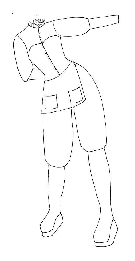
Famine was not cooperating with me this time around. Of the three designs, I think the first one is my least favorite. I think if I had to pick one, I would make the third design. I was aiming for a little more of a merchant feel, since Famine is selling food staples at extremely high costs. The apron was a must in my mind if I was going to do the merchant Famine. Although the third design has a non-functional apron, it’s definately my favorite of the bunch.  I like the blouse on the second design, with the ruffled neck.

Steampunk Death

I knew from the very beginning of the Steampunk Horsemen that Death was going to be the quintessential dapper gentleman, right down to a top hat. He was actually the very first of the designs I did when I started the project. I envision the vest in a fabulous black and copper brocade.

Bonus

Welcome to bonus coverage of the 4 Horsemen!

The original idea for the Horsemen (credited to my wonderful mother) was to have it be a repeating costume set with a different style each year. Since the first year established our characters, I didn’t really try to stick to a specific theme, instead going for the right look. Year 2 was meant to be the Steampunk Horsemen of the Apocalypse. Unfortunately, we lost our Death due to his being an idiot and have been unable to find a replacement. Also, we weren’t able to get tickets to ComicCon. But, I did manage to get the designs done and once we finally find a replacement Death, I plan on making these.

Steampunk Conquest

Here we have Explorer Conquest. She was initially inspired by a Victorian riding skirt that is actually present in this design. Unlike the western riding skirt of the same time period, it is an actual skirt intended for use by a lady riding side-saddle. I love the way it drapes over the one hip like that. The corset is back from the first iteration of the Horsemen, mainly because it was kind of expensive and I wanted to have it used again. The pith helmet was included to solidify the explorer theme. Looking at it now, I think I was influenced by Jane from Disney’s Tarzan.

I didn’t draw it here, but Conquest was meant to be given a crossbow.

Steampunk War

Much like the first round of Horsemen, War was designed to be a complete and total bad-ass. A lot of the armor pieces from the first round are included in this design, again because they were not cheap and we wanted to get some more mileage out of them. The ubiquitous steampunk goggles appear here, as well as a sort of gas mask. I imagined them protecting War from the nasty dust and dirt and poison of the battlefield. In addition to his sword, I gave him a revolver as a sidearm, mainly because I wanted to try my hand at steampunking and modding Nerf guns.


Tune in next time for bonus coverage of Famine and Death.

Death

I’m going to be honest here: I struggle looking at Death, much less writing about it. My ex was Death and I still have anger issues about how it ended.

7 When the Lamb opened the fourth seal, I heard the voice of the fourth living creature say, “Come!” 8 I looked, and there before me was a pale horse! Its rider was named Death, and Hades was following close behind him. They were given power over a fourth of the earth to kill by sword, famine and plague, and by the wild beasts of the earth.
-Revelation 6:7-8

Death is the only horseman to be explicitly named in this passage. At least there was no question about who it was I was costuming. “Pale” is not a very descriptive color though, so I was going to have to get creative there.

Design for Death

For a little while (as in about 5 seconds) I entertained the idea of doing a traditional Death, with the big, long robe and all that jazz, but that was way too boring for the rest of the 4H Club. Since I had already established the pattern of different eras of history with Famine and Conquest, I decided to go for an Italian Renaissance sort of feel. Colors were much harder to pick here, since I only had the description of “pale” to go off of, but I decided to go with deathly greens and greys that emulated the colors of a decomposing corpse.

Death. Photo by Simon Yee

I was very happy with the way the design translated into fabric. On some level, Death was very Jedi, with all the layers and the vest and sash. I loved the puffy sleeves and legs.

The hood was a nightmare though. The fabric for the shirt was pretty soft stuff and it was not going to hold up to what I wanted the hood to do. So I had to interface it, and that made it a little stiffer than I wanted. I wanted to put a piece of velcro inside the hood to attach it to his head so it could do unnatural things, but I just couldn’t get it to work the way I wanted, so we used a safety pin instead.

Those shoes were an experience. They are actually Tabi Boots, but we could only find them in black or white and neither color was going to work for this. So we decided to dye them. It had been a good long while since I had last dyed anything, but I went for it anyways. They came out much greyer than the intended color, but I still like the result.


So there we have the 4 Horsemen of the Apocalypse. They took up so much of my time for so long. It was a highly satisfying experience though. After doing all the designing, patterning, testing, sewing, fitting and finishing it was so great to see people’s reactions to the four of us. We had a hard time walking around the show floor because people kept stopping us for pictures. There was one little girl dressed as Hit Girl from Kick Ass that loved our costumes so much that she wanted a picture with us both days we were there. I overheard someone say that they thought we were promoting some movie or another. For me, that was the ultimate compliment, for someone to think that we were professionals. I can only hope that I can get a reaction like that every time I make costumes.

Famine

5 When the Lamb opened the third seal, I heard the third living creature say, “Come!” I looked, and there before me was a black horse! Its rider was holding a pair of scales in his hand. 6 Then I heard what sounded like a voice among the four living creatures, saying, “Two pounds of wheat for a day’s wages, and six pounds of barley for a day’s wages, and do not damage the oil and the wine!”
-Revelation 6:5-6

The third horseman is the most widely debated of the 4. A lot of people think that this horseman is Pestilence, but I disagree. Pestilence is a plague or disease, and by the description here, there is not what the third horseman is meant to bring. In verse 6, the creature speaks of astronomically high prices for food staples (wheat and barley), and says not to touch high end items like oil and wine made from temperamental fruits like olives and grapes. Because of this, I say the third horseman is, in fact, Famine.

Design for Famine

As you can see, I didn’t add color to this design. I felt like I shouldn’t since it was going to be black on black on black. For my Famine (I actually was Famine) I wanted a Victorian look. The tiers of skirts were decadent and a bit over the top, like Famine was rich off of everyone else’s suffering.

Famine with Death and Conquest. Photo from Rotten Tomatoes

Famine. Photo by Simon Yee.

There was so. Much. Sewing. I actually started on Famine first, and she was the last costume I finished. There were a lot of pieces to the costume too. The mask was actually custom made for me. Originally I had wanted a black mask to go with the rest of the costume, but I liked the way the lighter color stood out. At one point, someone said that I was like a creepy, china-faced doll and I was the thing nightmares were made of.

The shrug was actually supposed to be my pattern mock-up, but I liked it so much that I didn’t even bother remaking it. The hood was really simple with just one seam. I wanted something to cover up my head before I put on the mask, just to completely dehumanize myself. Actually, the goal of these costumes was to create things that looked and felt less like humans and more like the demons they are.

There are actually two different corsets I made for this costume. You can see the first in the top photo. It is made from a black on black brocade and has points at the top and bottom. I wore that on day 2 of ComicCon. The pinstripe corset was made to match the shrug and was worn the third day of ComicCon. Of the two, I prefer the look of the pinstripe corset, but the brocade has a little more cinching power to it.

The skirts… oh the skirts. They were actually a lot fuller than shown in the photo. I think the angle of the picture is making them look weird. In the order I had to put them on, there was a hoop skirt, a broadcloth petticoat, a two layer tulle petticoat, the long skirt, the middle skirt and the short skirt. I made both of the petticoats and all three skirts. The skirts were all cut at the same time to the same length. I then trimmed the middle and short skirts to be 4 inches shorter than the skirt below them and added a 6 inch ruffle. They also had ribbon inserted into channels on the seam allowances that let me gather them up as I wanted to. I gathered the short skirt on every seam, and the middle skirt on every other seam. The long skirt was left ungathered.

War

 3 When the Lamb opened the second seal, I heard the second living creature say, “Come!” 4 Then another horse came out, a fiery red one. Its rider was given power to take peace from the earth and to make people kill each other. To him was given a large sword.
-Revelation 6:3-4

The rider of the red horse, much like Conquest, is not explicitly named, but it it generally accepted that it is War.

Design for War

War gave me fits. He was the last design I even attempted, and then I went through 4 or 5 different designs before deciding on this one. At first I wanted to do Spartan War, but I felt he was too similar to my Conquest. There were a few other designs that just weren’t manly enough, since War has to be a total bad-ass. It was on Christmas Eve that Nordic War finally came to me.

War. Photo by Simon Yee.

War. Photo by Simon Yee.

War is a manly, manly man. When I was working on the design, I knew I wanted leather and fur. After all, if he’s War, he’s probably out killing animals as well as humans. Or maybe that’s human skin leather. The armor was all bought because I didn’t have time to learn how to make leather armor on top of all the sewing I was doing. We argued and debated on each and every piece except the pauldrons. We could only find one pauldron in red. The helmet was custom made for us.

The tunic gave me fits. First I couldn’t find the right fabric, then once I did I couldn’t get the leather strips on it correctly. If I ever use a technique like this again, I’m putting the leather on before I cut and sew. The look is great though.

Much like Conquest, I love the cape. I love it. It’s made of a red suede-cloth that I was originally going to use for the tunic before I found the other tunic fabric. Originally I was going to line it in another red or maybe black, but I liked the back side of the suede so much I just left it the way it was with just a hem. Because of that, I decided not to trim all of the edges with the fur. Instead I put it only on the bottom and collar. Both of these pieces of fur were found in remnant bins at one time or another and put in my stash until I found them perfect for War. I really love the silver-grey fur at the bottom. I could make a sheet out of that fur and sleep on it.

Conquest

We’re going to take a trip back in time to the largest and most time consuming project I’ve done to date: the 4 Horsemen of the Apocalypse. This was a project that was 7 months in the making, starting before Christmas 2009 and culminating in ComicCon 2010. There was a lot of blood, sweat and tears that went into these 4 costumes, but I am still very, very happy with how they came out. We’re going to start with Conquest.

1 I watched as the Lamb opened the first of the seven seals. Then I heard one of the four living creatures say in a voice like thunder, “Come!” 2 I looked, and there before me was a white horse! Its rider held a bow, and he was given a crown, and he rode out as a conqueror bent on conquest.
-Revelation 6:1-2

I’ve found it interesting how the colors of the horses are always talked about, but there’s very little said about the riders. The general consensus is that the rider of the white horse is Conquest though.

Design for Conquest

I told you we were going back in time. My style here is very odd. I don’t know why I didn’t draw exposed body parts. I think I didn’t want to distract from the costumes themselves. Anyways…

Conquest is odd. I wanted the Greek/Roman goddess type feel, and I definitely got that. This ended up not being the final design, mainly because someone who shall remain nameless decided that she wanted to keep changing things. At one point there was a vest (horrible thing really) that was actually made and cut from the final costume.

All 4 Horsemen. Photo by Simon Yee

All 4 Horsemen. Photo from Tested

There are actually no pictures of just Conquest. There are pictures of everyone else alone, just not Conquest. Silly Conquest. Here you can see the full evolution of the costume. The skirt got significantly shorter through the elimination of the longer underskirt. I still wanted to find her a breastplate, but it’s very difficult to find women’s breastplates that don’t cost $300. Eventually we found this white leather corset that still had an armored feeling to it.

You can’t see it, but that cape is magnificent. We struggled for ages trying to find the right fabric for the cape and we finally found this beautiful white and silver brocade. As a bonus, it looked awesome on both sides so I didn’t have to line it! That was actually the easiest piece in this whole thing to make. I literally got two yards of the fabric and hemmed up all 4 edges.

That skirt gave me nightmares. The fabric was found on the remnant floor of Britex Fabrics in San Francisco and I only had 1.5 yards of it. I had to use pretty much every last inch of that fabric. And then I had to pleat it. I never want to do that many box pleats again.


Two Kings

The last two characters I had to do were the two kings: King Stephan, Aurora’s father, and King Hubert, Phillips’ father. They are opposites physically, with Stephan being tall and thin while Hubert is short and round. I wanted them to unquestionable be kings, but I had to make them have different styles to imply they were from different kingdoms.

King Stephan's Royal Garb

I really like this costume for a king. I actually based this on King Edwards VII, though I eliminated a lot of frills and lace from that design. I love the cuffs on the tunic with the shiny gold buttons. The cape if made of white fur that I illustrated in the swatch and velvet in gold and navy blue. I was getting a bit silly at this point and decided to base his colors on the colors of the Fantasmic! Guest Control costume I wear. I jokingly call him my Fantasmic! King. I really like his shiny boots though.

King Hubert's Royal Garb

While Stephan was based on a British King, I looked to France for inspiration for Hubert. Some of the details got lost in digitizing, but I’m still really happy with how Hubert turned out. It’s a little more obvious on the flats, but he has a stripe of trim running down each of his pant legs. Unfortunately the red in the stripe decided it wanted to blend in with the red of the cape lining and disappear from my illustration. It’s there, I promise. The fabric swatch is for the exterior of the cape and is meant to be a velvet with a diamond pattern on it.


That is the end of my final project, Beauty goes Burton. Overall, I was extremely happy with what I did, though there are little things that I would fix or change if I did this again. All of the hard work paid off though, since I got an A in the class and enjoyed it along the way.